Need to Increase Online Sales
Let’s start with establishing the obvious. If you have a website I’m assuming you have a business, and if you have a business I’m assuming you want to sell something!
That something could be a number of different things, it could be a product, a service, your time or even your knowledge.
Let’s also establish that 4 letter word that so many people find so offensive, SALE.
It’s a word we don’t like because we don’t ever want to be “Salesy”, or “Pushy”, or cliche “A used car salesman”. Once we approach our product with a value over money mentality we can start to approach our website with a logical perspective.
When we know the value in our product, we no longer have to “sell it”. We believe in it and with that comes a much more natural sale that we’re comfortable with and the consumer is too.
Your website is really no different to an in person sale. Even if your website is not directly selling as an e-commerce or online store would, your website is always promoting you, your company, your product in a way that navigates your potential consumer to the ultimate sale, booking, membership, etc.
For everyone of us there is a mental sales process we go through when making a purchase. Some of this is conscious, such as budget and some is through our subconscious, which is often triggered by excitement. More often than not the budget will go out the window when we get excited about a purchase.
However excitement can get diluted with systems that are frustrating, confusing and slow, which is when we revert to our conscious cautious self.
So now we have established that your website should be an important part of your sales force and we’ve established you have a product/service that you fully believe in, all we have to do is take your potential client through a seamless, comfortable process. We need to create awareness, interest, decision, action!
Awareness- Within seconds of clicking on your site a potential customer has made a quick subconscious evaluation of what your site is saying.
Be clear in the awareness you want to create and what you want to say through your website.
Interest- If a potential customer is visiting your website they already have the interest. It is your website’s job to harness that interest in the right direction with clear information and solid navigation systems.
Decision- Once your website has navigated your potential customer to the purchase point, there is still a decision defining moment. If your website has done its job, by this point the decision will be made quickly, easily and without worry.
Action- Now we come to you. Your website has done its job. It has created awareness, peaked interest and made decision making easy. Time for you to jump into action and fulfill your company promise to your valued customers.
Before we get into the how, I want to illustrate this with an analogy. I want you to imagine walking into a clothes store. You want to buy a new pair of jeans and you know that this particular store sells jeans along with other stuff.
You walk through the store doors and you instantly make a quick subconscious evaluation of the store. This could be good or bad.
The store is nice and bright, everything is merchandised well, plenty of signs to navigate you, it’s clean and so on. It could also be dirty looking, messy, confusing and all round not give you a good impression.
This is already step one in building confidence in the consumer and all you’ve done is walk through the door. Now you start to look around for what you came for and maybe also come across other stuff you didn’t. You look first for the woman/man department in the store.
You find your department easily, the store is well-signed, the walk ways are free of clutter, and there’s a sales assistant to answer any questions if needed.
Or there might not be any signs directing you, there might be clutter or boxes in the isles, there might not be a sales assistant to help. Here we’re into step two of our sales process.
Are we building a good experience for the consumer?
Are we helping instead of frustrating?
Once you’re in the woman/man department now you’re looking for the perfect pair of jeans you came to purchase. Luckily all the jeans are in one place, they are hung in size order, they are merchandised by color/length/style, they are clearly priced and there is a convenient changing room to try your options on.
On the other hand, the jeans could be mixed in with a bunch of other clothes, not priced, difficult to find and the changing room is at the other end of the store.
At this point most of us are making a decision, we’re either trotting off to the cashier with our jeans draped over our arm, ready to purchase. Or we’re trotting out the door with nothing in hand.
I know which experience makes me want to buy. The final step is simply taking the action to buy. Again this has to be a good experience.
The checkout has to be quick, the cashier has to be friendly and you want to walk away feeling happy with your purchase.
Like I said before your website is no different to an in-person sale.
So how do we accomplish a better experience for our customer and higher conversion rate for your sales? Here are 5 steps to improve your website sales.
Before you continue, we want to introduce the author and share where she gets the experience to write about this topic. She really knows her stuff!
Please meet Rea – Sales Coaching Specialist

MEET REA – SALES GENIUS
MEET REA – SALES GENIUS
I am your personalized website sales consultant.
With 22 years of direct to consumer extensive experience and 12 concurrent years of online website design and business sales consulting, I am uniquely qualified to help take your business website sales to the next level.
With this service you will receive a full personalized website consultation.
In this analysis we will be taking a detailed look at your customer experience from the second they click on your website to the time of purchase.
Are your potential customers navigating around your website with ease, speed and clear understanding?
Are you directing your potential customers on a clear sales map with an obvious call to action and simple check out process?
Or are your customers frustratingly clicking from one page to another, confused with information and what to do next in their purchase process?
While you may be an expert on your company website, it can sometimes be forgotten that potential and even existing customers are not.
We want to make sure that your website is reaching its full potential as a front line ambassador for your business by ensuring it gives the best sales experience from beginning to end for your valued customer.
You will receive a full detailed report on all elements listed above.
This is not a software automated report!
I personally will be going to great lengths to analyze your website.
Once you have received the report we will set up a time to get on the phone together while screen sharing your website.
This will give us an opportunity to get more in depth and detail.
I look forward to working with you as a team to maximize all business opportunities through your website.
– Rea
#1 Layout and Sales Map to Increase Online Sales
As we go through the 5 steps keep in mind the K.I.S.S. methodology, Keep It Simple Stupid!
I can’t stress enough that we need to keep things simple and logical for your consumer. While you might know your website and product inside out, your potential customer doesn’t. So we want to keep things simple. Your layout needs to be clean and clear, without fuss.
An overly cluttered home page can very quickly turn a customer away at step one which is their first impression. Less is more for your home page. We want to make sure your main menu has a clear format with sub menus categorized correctly.
We don’t need every single option on your main menu. Your home page layout should also include a well placed call to action (I will cover this more later). Include your main product or services on your home page as highlighted features but again we don’t need everything on page one. If it takes a day to scroll through your home page then you have too much information there.
Your layout also has to be consistent throughout. A consumer gets used to shopping and navigating a certain way. A lot of us will go into our grocery store and navigate around pretty much the same way every time. When the grocery store changes their layout, it takes us a moment to adjust.
Now imagine your website as a store, is it consistent throughout?
Is the layout the same on all pages?
On top of that is your branding the same throughout?
Ok so we have your homepage basics, clear menu, call to action, featured services/products. Obviously there will be other things here and there on your main menu, maybe depending on your business but let’s not over complicate things for the purpose of simplicity.
Now onto your sales map. This is basically the steps a consumer will take to make a purchase. Ideally we want this to be as simple as 3-4 steps at the maximum. Beyond that you are likely to lose sales, create frustration and create confusion.
For example:
STEP #1
I go to your site, I click on the menu option that best suits my needs.
STEP #2
Maybe I click on a sub menu option too that narrows my search more.
STEP #3
I look around and click on the service that I’m looking for or the product I like best.
STEP #4
I like the product and I click to purchase, subscribe, book an appointment, whatever that particular business is offering.
I know that seems overly simplistic and it doesn’t account for surfing around your site for other options to purchase but the point of the map is to eliminate the extra steps that might be getting in your way. Here are some of the things that might veer a consumer into a different direction. Links!!
So often I see websites with links to another site!
How crazy is that?
You’ve got a potential customer to your site but now you’re navigating them to somebody else’s site. Irrelevant information, I literally just worked on an attorneys site that listed all the local grocery stores, why?!
While that is an obvious case of irrelevant information, there are so many times sites get cluttered with just too much stuff. Dead end and circling back navigations that take you away from the sales map is another way consumers get veered away from the same.
Dead ends take you to a destination with no point of sale and circling often takes you back to the beginning. So again to drill in on what is important for your layout and sales map, it is simplicity.
#2 Navigation Systems to Increase Online Sales
Ok so this is similar to your sales map. This is how you give directions around your site. Using the store analogy again, we want to create unsaid directions that take your consumer to where they want to be and ultimately to where you want them to be, and that is the sale.

In a store we follow unsaid directions. We see all the fruit and vegetables in one place and navigate in that direction if that is what we want. Or we see signs in the aisles that are clearly labeled to be able to find things with ease. There is a sales assistant on hand if we need to ask a question.
The cashiers are located in a certain place. Sale merchandise is prominently displayed on end caps to capture your attention. All these things that we have become accustomed to are in place as unsaid directions that we subconsciously follow without even knowing.
A gym is laid out a certain way, a bar, a restaurant, even your house. And they all navigate us a certain way. Imagine having fruit at one end of the store and vegetables at the other end of the store, and the cashiers at the back of the store. It just wouldn’t make sense.
So we want to make sure we are navigating our website customers in the same way.
Is your product/service merchandised well on your site?
Is it easy to find?
Do you have signs?
Your menu should clearly be the first point of navigation or your highlighted features on your home page. Once the consumer has navigated to their menu option then they may be faced with a sub menu.
Are all your sub menus simple and a clear direction to the next step and categorized correctly?
I often see, when working on a sales plan for a company website, overly complicated long sub menus. Just like on a store aisle sign, I don’t need it to say ‘Golden Grahams’, I just need it to say ‘Cereal’.
I then know I will find all the cereal down that aisle. The other mistake with sub menus is just throwing something in because you don’t know where else to put it.
Everything has a place, you just need to find the most suitable place.
Now the consumer has been navigated to the menu and the sub menu, where are you taking them next?
Hopefully to the next stage in the sales process.
Here we should be clearly on a product or services page. Again layout should be simple, consistent and clear. The customer should be able to find what they are looking for with ease. Once they do, it is the website’s job to direct them to the sale.
Again this might not be an actual sale, It could be a point where they reach out to your company directly, or sign up for a membership, whatever your business product service is, this is the point where they take action.
If your navigation systems are complicated, confusing, frustrating, dead end, circle back, your consumer will not get to the point of taking action.
#3 Create a Call to Action to Increase Online Sales
What is a call to action? Well let me start with what it is not. It is not something or just anything you want your customer to do.
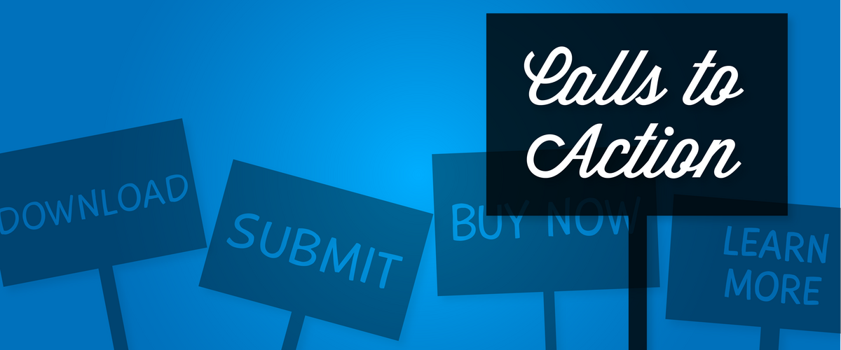
I have worked with many company websites and they tend to fall into one of two categories. One being the category of being too scared to have a call to action because they could seem overly pushy or salesy.
Two being the category of website which becomes one big call to action everywhere you turn. It’s like walking into a store and a sales associate running up to you at every turn and flashing a big sign in your face with the latest sale.
So let’s lay off the pop ups. I’m not opposed to the odd pop up or the live chat but lets not have those things springing up every single time I navigate to a new page.
Honestly it’s annoying. So what is a call to action? A call to action should be something that invokes an immediate action to be taken. They can create a sense of urgency in the consumer. The most commonly used are things like “Buy Now”, “Sign Up Here”, or limited time type of offers, “Offer Expires Soon”, “Limited Stocks Available”.
A series of small calls to actions are effective too.
For example simple things like picking a color, size or creating a profile is building your client up to the final sale. Once these much smaller call to actions have been completed a consumer is already predisposed to complete the purchase.
The type of call to actions I would like to focus on here though are the ones that stay consistent throughout your site. For this you need to focus on what you want a customer to do on your site.
Typically this is something that navigates a customer to click and continue down a conversion funnel. Call to actions can also be useful for getting customer information into your system too.
A “Sign up for our latest newsletter” or “Click here for our latest deals”, can be a way of capturing the customer’s email. One prominent call to action that stays consistent on every page of your website is most effective.
This could be an email capture, it could be your main product to bypass the extra buying steps, it could be a ‘call now’ or ‘contact now’ type of thing, or even just ‘latest deals’.
The main point of a call to action is to create some urgency and excitement. Remember people buy when they’re excited to buy.
We need to eliminate as many of the objections in their head as possible by making every part of their buying/booking process exciting.
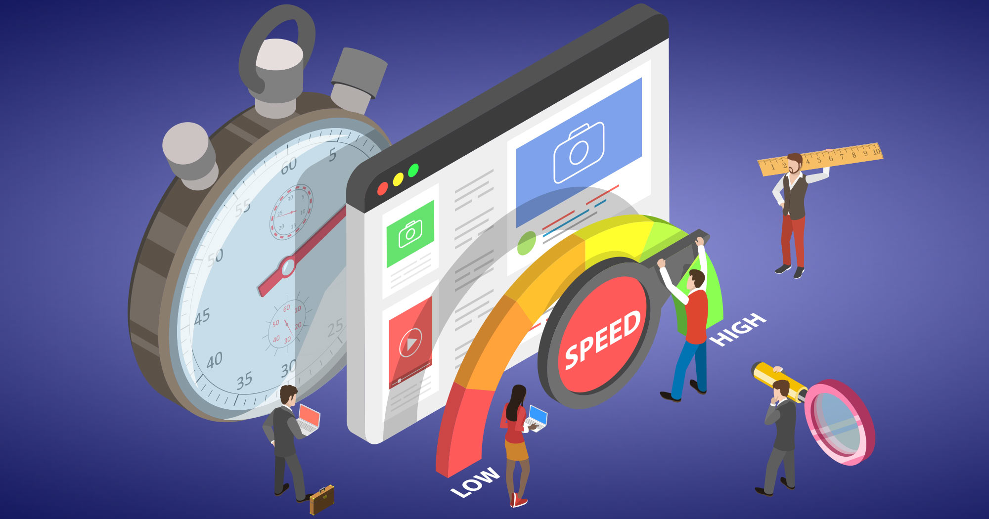
#4 Speed is Key to Increase Online Sales
It is just a fact, people do not like to wait! They are impatient and want any sales experience to happen quickly and smoothly.
I don’t know one person that loves waiting when going through the purchase of a car. It is all fun and games when you’re walking around the car lot and test driving the car.
Then you make the big decision, and what do you get to do next…. sit for hours doing all the paperwork and the back and forth with the sales associate. It is exhausting, frustrating and annoying.
As for your website every aspect of it needs to be fast! People are impatient during an in person sale, but they are doubly impatient online. Firstly your page load time has to be fast! Nobody wants to wait for a page to load. Second is more related to the navigation systems and sales map. People also want to find what they’re looking for quickly.
If they have come to your site then they already have a preconceived idea of what they are looking for. Just like when you walk into a store, you might not always know exactly what you want but you have an idea.
The good stores, or the ones that have a good sales map and navigation systems actually have you walking out with the thing you wanted, plus a bunch of other stuff you didn’t even know you wanted or needed. Your website needs to function like that store.
Everything needs to be quickly accessible for the things the consumer came to find. Long winded navigation, complicated systems and frustrating information will have your potential customer clicking away from your site.
Thirdly, let’s not lose the customer at the last hurdle. Maybe the customer has clicked around your site and found what they wanted and they’ve decided to buy. Just like at the car dealership, you don’t want them becoming exhausted with checking out.
Without fail when I shop in TJ Maxx there is a line to the cashiers a mile long, I never mind because I know it is going to move quickly.
Everybody is working fast and efficiently. Your check out page has to do the same thing. It needs to be the most streamline system you can find.
Maybe your “point of sale” is not an actual sale on your website. Maybe you want your customer to call your company and make an appointment, or book one online.
Again if the customer gets to that point and nobody answers the phone or they’re instantly put on hold they will become frustrated quickly. Or booking an appointment becomes like visiting the DMV site, you’ve lost them. Going back to one of my key words in this, SIMPLE is essential but so is SPEED.
#5 Use Visitors Sales Experience to Increase Online Sales
What can I say other than, it ALL matters. If you take a look at your website and see things that could affect the customer experience, change them. You can do 9 out of 10 good things but it will be that 1 bad thing that will still be in the customers head.
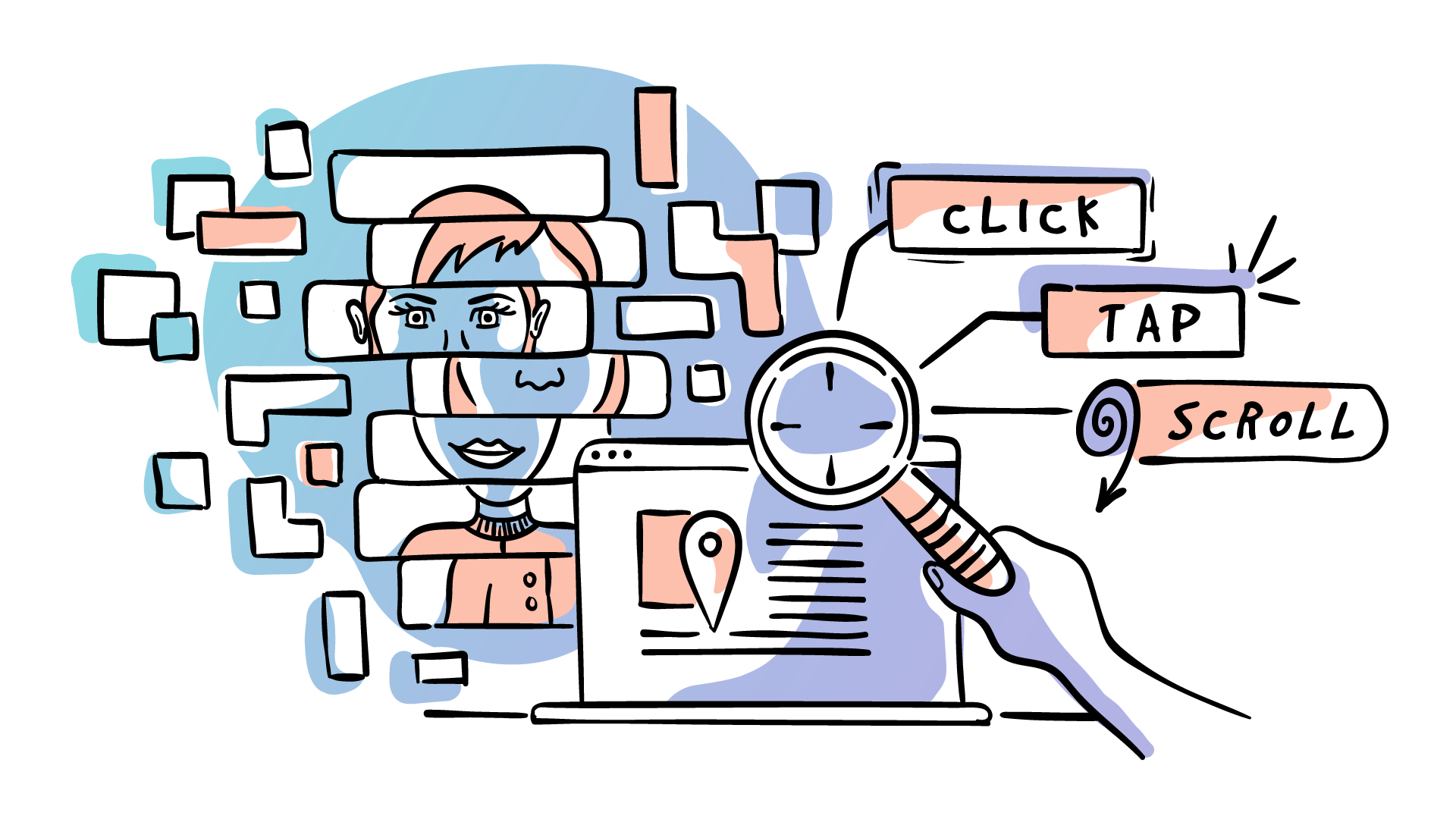
The sales experience starts the second the click on your site and continues all the way through to the sale. Every single one of the points above are important to that experience.
From first impression to simple navigation to a fast check out. We don’t want your customer saying BUT. “I like their products BUT check out is so slow”, “I found what I wanted BUT it took me forever”, “My friend recommended them BUT the website is lousy”.
Worse than them saying BUT is them not saying anything at all. That means you lost them on one of those BUTS. Think about what you enjoy as a visitor sales experience going into your favorite store and make your website feel like that.
Also think about what irks you in a bad experience and analyze your site to see if you potentially could be irking somebody else.
All in all a website is not just something you throw online because you have a business.
It should be the best representation of your business, it should be maintained and checked regularly, it should build confidence in your consumer and ultimately it should be an intricate sales tool used as part of your business, adding credibility to your company.
Book a FREE call with Rea below!


